30.11.12

P2 : 32 Summary - Learning cycle 2


Learning cycle 02
PG02
Communication Design
RAVENSBOURNE
_
Exhibition Design of The Titanic 
specialist collaboration 

_
Subject : The Moment in Time 
Collaborators : Ilonka Ligteringen / Wang Mengying / Joong Gul Ro


Overview
_
This collaboration work was about the Titanic exhibition based on subject the moment in time. The final work contains lots of designs such as poster, advertising, banner, invitation card, floor plan, promotional video, signage, website, information wall graphic and timeline on the floor etc. about Titanic’s history. My parts of tasks were about print design, floor plan with 3D view and video.


Brainstorm
_
During this work, I researched lots of information about the Titanic. By the time, I inspired about the time during the Titanic was sinking (2 hours 40 minutes) because it was the worst moment in time about the Titanic history. Therefore, I recommended to use 2.4hours as the title and Peter(tutor) advised to add the time of building and voyage was 3years and 6days respectively. Finally, we made a decision that exhibition title was Titanic; 3years 6days 160minutes voyage.
In the artwork style of the exhibition design, I concerned Dadaism art style which was at the same time when the Titanic was built and sunk. Collage technique was the important art style in Dadaism. That is why I suggested to apply collage into this collaboration project and two fellow students in my group, who were Ilonka Ligteringen and Wang Mengying, agreed to use collage art.


Work
_
I’d designed posters and tabloid advertising firstly but the other group brought the British Museum’s design guidelines which has very strict rule about poster and signage. Even though this project was hypothetical, we decided to follow the guidelines so that it could have more reality. So I changed my layout of poster and advert suit as the British Museum’s guidelines.

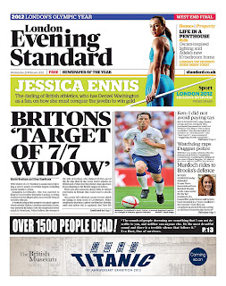
The poster and Tabloid advert design has used to collage technique in line with that used in Dadaism in the early 20th century. The background uses the blue print of the ship. The important images used are the captain, the wireless operator, the designer and musicians etc. These are used to conveys the story of the Titanic to the public. This advert is a teaser.
On the bottom of news paper’s cover just shows the exhibition logo and ‘Coming soon’ without saying anything else. An imitation headline of ‘Over 1500 people dead!’ is used to shock the reader and encourage them want more information and keep reading on page 13 which shows the exhibition advertising.
Applied a QR code which can be used to connect to the exhibition’s promotional video.

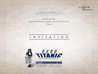
In invitation card, I put SOS signal on the card that was ‘SOS, SOS, We are sinking fast passengers being put into boats. Titanic.’ It is also very interesting stuff for me and will be similar meaning as inviting to the exhibition. Because the SOS is someone’s call for help.

The banners follow the design system colours of Red and Blue, as well as the background beige. Insistent, eye catching logo, easily seen from a long distance.

Information Board will show descriptions about each section of exhibition. There will be Touch Screen Information Point where visitor can learn Titanic’s facts and watch videos. There will be artifacts on display which have been rescued from the wreckage.
A promotional animation video is available on youtube to connect through the QR code.

_
I designed below :

Basic System :              Logo
Colour
Typeface

Application System :     Poster
Tabloid Advertising
Invitation Card & Envelop
Long Banners (2 set) / Short Banners (1 set)
Promotional Signage (outside)

Floor Plan :                 Information Board
Touch Screen
Showcase
Floor Plan
3-D view Floor plan
Promotional Video
Presentation Design


Finish
_
It was a good opportunity to work with someone as a collaboration work. But something was hard to me when I was working in this collaboration project.
I had to try to make 3D floor plan for this project even though I did not know well about making 3D. Because there were nobody wanted to make it. However, I am satisfied with my 3D work that I spent very long time to make it by just illustrator and photo-shop. Nevertheless, the project has finished well but I need something more to do might be in the future. It was a nice experience for me.

29.11.12

P2 : 31 Final Promotional Video

This is the promotional video for Titanic exhibition. it designed by me and animated by Carlos tuco Egry who is one of my fellow students in MA visual effect course. Directed by me. 

It follows the story of Titanic from starting voyage to sinking. It supposed to add sound effect but did not have enough time to do. However, it seems good fun to public especially young people even though very simple and a bit funny.

I suggested to apply it in our final presentation but Ilonka and Robin did not agree because it is not suitable with british museum. So we decided to apply only its story board into presentation. 


P2 : 30 Final Floor Plan

Information board, Touch screen and Showcase design.
Floor plan and 3 dimensional floor plan.

Information board / Touch screen / showcase

Floor plan
3D view floor plan

P2 : 29 Final Banners

Short and long banners with simulations


P2 : 28 Final Invitation card and signage

Invitation card


Envelop front

Envelop back


Promotional Signage


P2 : 27 Final Poster and Advert

I redesigned poster and tabloid ad.

Poster

Tabloid teaser cover

Tabloid


P2 : 26 Simulation sources for advertising


P2 : 25 Examples of floor plan

Researched some examples of floor plan.


P2 : 24 Titanic Exhibition Identity Basic System


P2 : 23 Touch screen and statue

I though some ways of showing information about Titanic as a touch screen which will show some videos to visitors. It could be the shape of Titanic.


P2 : 22 Process of Floor Plan

I'm trying to make a 3D floor plan by illustrator and photoshop. dividing 4 sections; Structure, Journey, Passengers and Arti-facts. I will put some acrylic panels as dividing wall in order to exhibit some more information.
It's going to be connect between Titanic's facts & figures before entrance and legacy after exit which will be make as a timeline on the floor and stairs by Robin.

27.11.12

P2 : 21 Process

I designed Invitaion card, Poster and tabloid AD.
but the other team brought the design guidelines of the British Museum, according to that, there are strict rule how to make a poster and a signage. Even though, this is a hypothetical project, we are going to follow the guidelines. therefore, I will change this design layout.


P2 : 20 A story board of video

Just very rough story board for a promotional video.
It shows the story of the Titanic's journey form leaving Southamton to sinking on the middle of sea.
I asked to help Carlos who is in MA Visual Effect.


P2 : 19 Process of poster by collage

I am trying to apply collage style. 

P2 : 18 Collage Art and Dadaism

When I was thinking about artwork style for the Titanic exhibition I concerned about dadaism. Because dada style was the same time with the Titanic was. Especially there was a specific art style in the early 20th century ,when the Titanic launched and sank, was collage style. Thus I suggested to apply collage to our Titanic project.


DADA
_
Dada was a cultural movement that was concentrated on anti-war politics which then made its way to the art world through art theory, art manifestoes, literature, poetry and eventually graphic design and the visual arts. The movement, although Dadaists would not have been happy calling it a movement, originated in Switzerland and spread across Europe and into the United States, which was a safe haven for many writers during World War I.

An anti-art movement, Dadaists attempted to break away from the styles of traditional art aesthetics as well as rationality, of any kind. They produced a great many publications as a home for their writings and protest materials which were handed out at gatherings and protests. The visual aesthetics associate with the movement often include found objects and materials combined through collage.


Cut With The Dada Kitchen Knife, Hannah Höch, 1919

Cover of Anna Blume, Kurt Schwitters, 1919

Cover for Merz 7 Kurt Schwitters, 1924

P2 : 17 Some idea sketches

I made some idea sketches for poster, advert, floor plan and some 3D things. 


Advertising
_
It could be eye catchable to make like a real news headline and showing just exhibition logo as a teaser.


Invitation card
_
There is quite interesting stuff which is the SOS signal from the Titanic when it was sinking. The SOS signal means 'come to me and help' so that it's going to be similar way to encourage people come to visit to the exhibition.


Advertising & Poster


Invitation card & Information board


Floor plan and visitors moving plan